Soon after Apple added the Dark Mode to its desktop email UI in 2018, almost every email client and social media app has joined the bandwagon. Do you know that you can improve your email deliverability by using the dark mode? Yes, you read that right.
Today I am going to discuss how you can use the dark mode theme in your HTML email templates to improve your engagement rate, open rate, and overall deliverability metrics using this trend. Read the blog ahead to discover the bright results of using the dark UI for your emails.
Dark Mode For Email: The New Normal For Lowlight Environments And Night
The dark mode is aimed at improving the user experience through a reversed color palette with lighter typefaces for better visibility during use at night and low ambient environments. This reduces the glare and allows the user to view the mobile screen without hurting their eyes. It is the new normal as people are habituated to stay indoors for long now, and reading messages at night can be easier with the dark mode on. Below is an example of how an email looks in the default color scheme and dark mode for email:
How Dark Mode Improves Email Deliverability
To begin with, consider a scenario where a person is browsing through their inbox at midnight with dark mode on and suddenly finds a message designed for default UI. The very moment they open the email, it would shun their eyes and strain them heavily. Such readers are less likely to open any emails from the concerned brand in the near future.
The dark mode is not a part of any email metric, but it can have a tremendous impact on your engagement. While it is user-friendly, your subscribers would also prefer viewing in the dark color scheme owing to its aesthetic appeal. The below infographic will help you understand the impact of bright screens:
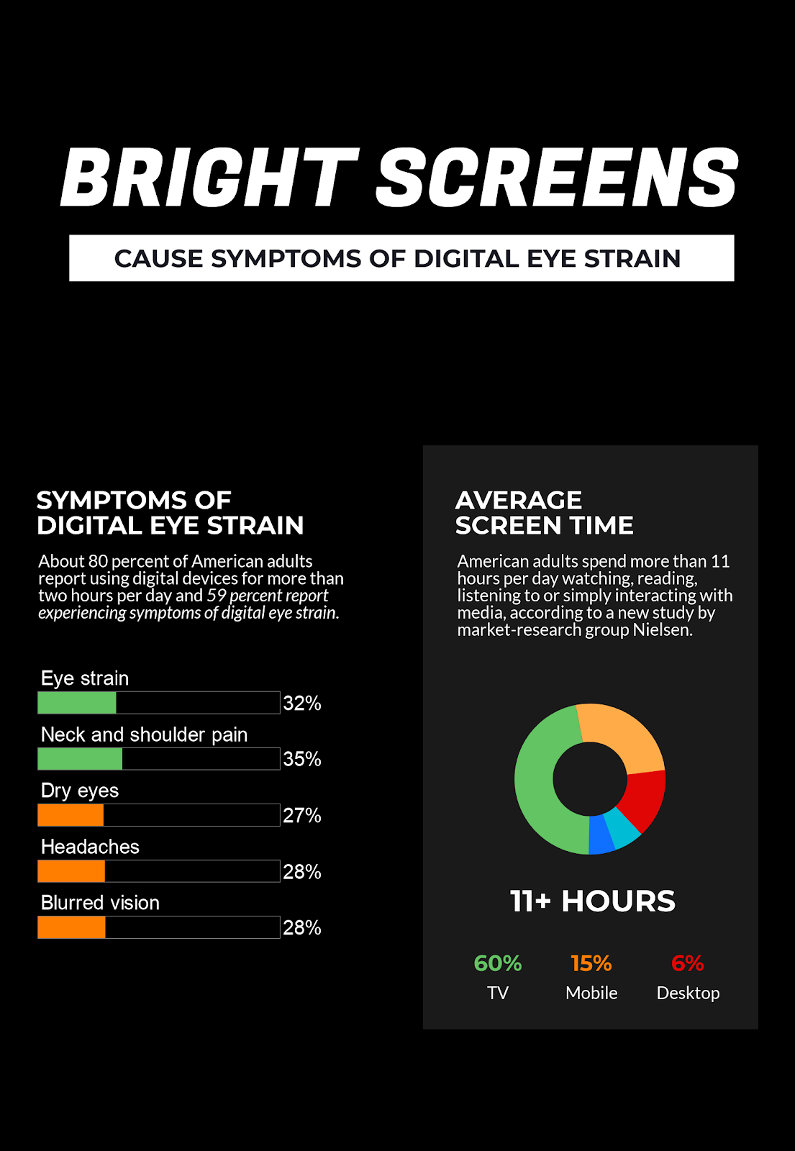
As we can see, dark mode-friendly HTML email templates have a direct impact on engagement rate as they extend convenience to your subscribers. This also saves you from losing CTR and conversion rates in cases where the color inversion ruins the legibility of your messages. Also, you would not lose a subscriber or get unsubscribed and marked as spammed just because your message bombarded your readers with photons.
Your subscribers are likely to engage with your messages as most of your competitors won’t be optimizing their messages for the dark UI. Thus, dark mode will surely save you from any unwanted actions from your subscribers while extending UX benefits. Which Inbox Providers Support Dark Mode
In this section, we will have a look at various inbox providers that support dark mode for emails. I will also list down other apps and platforms that currently support it for you to understand the importance of providing a homogeneous user experience. Check out the list:
Mobile Apps
- Gmail app (iOS/Android)
- Outlook app (iOS/Android)
- iPhone Mail
- iPad Mail
Desktop Clients
- Apple Mail
- Outlook 2019 on (macOS and Windows)
Web-based Email Clients Outlook.com
- Outlook.com
- Hey.com
- Gmail
Operating Systems
- Android
- Windows 10
- IOS 13
- Mac OS Mojave
Browsers
- Google Chrome
- Safari
- Mozilla Firefox
- Microsoft Edge
Chat Services
- Slack
- FB Messenger
- Whatsapp Messenger
- Skype
Social media
Productivity tools
- Notion
- Trello
Thus, your subscribers are more likely to land on your email from any of the above apps/platforms, and you can maintain UI consistency by optimizing your email messages for dark mode.
Tips For Using Dark Mode To Improve Email Deliverability
After understanding their impact of Dark Mode on email deliverability, let us see a few tips on using it in your future emails:
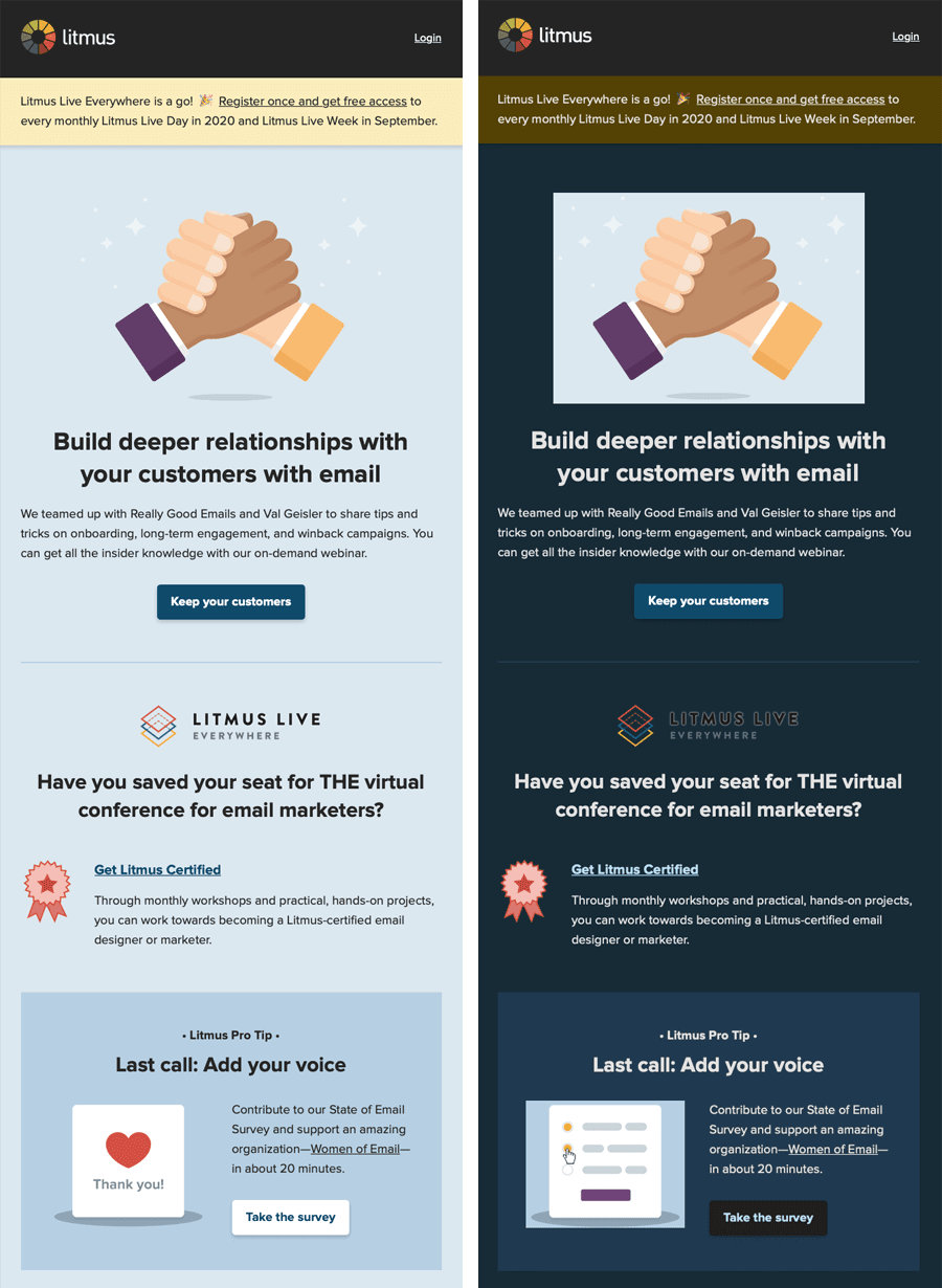
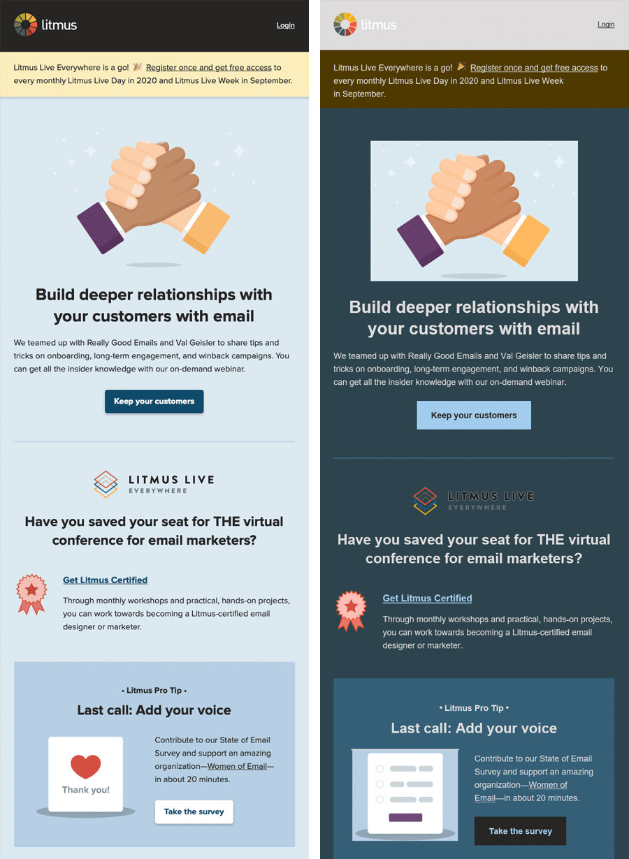
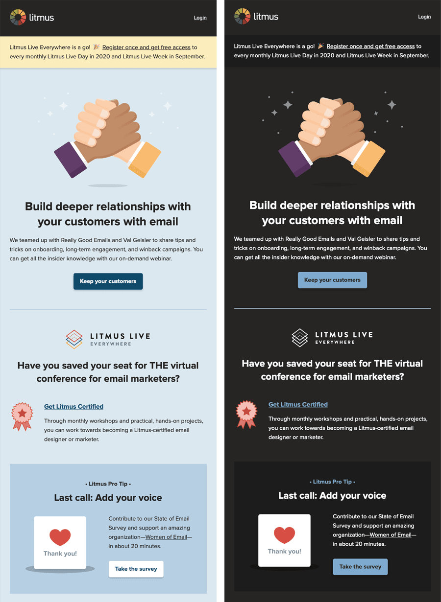
Before we move forward towards the tips, have a look at the side by side view of email rendering in different cases so we can learn how to prevent issues:
Partial Color Inversion During Email Rendering:
Full-Color Inversion During Email Rendering:
Properly Optimized Email Rendering In Dark Mode:
#1. Add @media (prefers-color-scheme: dark) for optimizing your messages with UIs supporting dark themes. (data-ogsc) is used for Outlook (in CSS rules), but there’s no standard available for all email clients yet.
#2. Make sure your logo, brand elements, and images are optimized for all theme options.
#3. Make use of transparent images whenever possible.
#4. Reinforce the font color with a contrasting stroke around your email typefaces.

#5. Test Before Finalizing
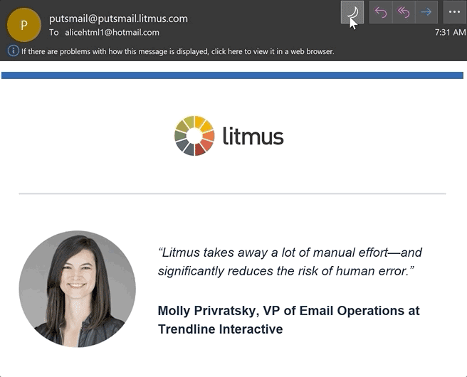
I recommend testing your email templates before you finalize them to ensure that they fit in both themes. You can use testing tools like Litmus and Email On Acid along with sending the emails on a test device. It will help you understand how your messages render and how you can improve them.
Over To You
This article covers most of the aspects of optimizing your emails for the dark theme to improve deliverability, and I would like to bring one point to your attention: Engagement is the basis of all email metrics, but dark theme isn’t the only factor that impacts it. You should focus on other factors too, but missing on dark mode is not an option as it might bring you sales just because your competitor didn’t. I hope you find this article useful for your future campaigns.